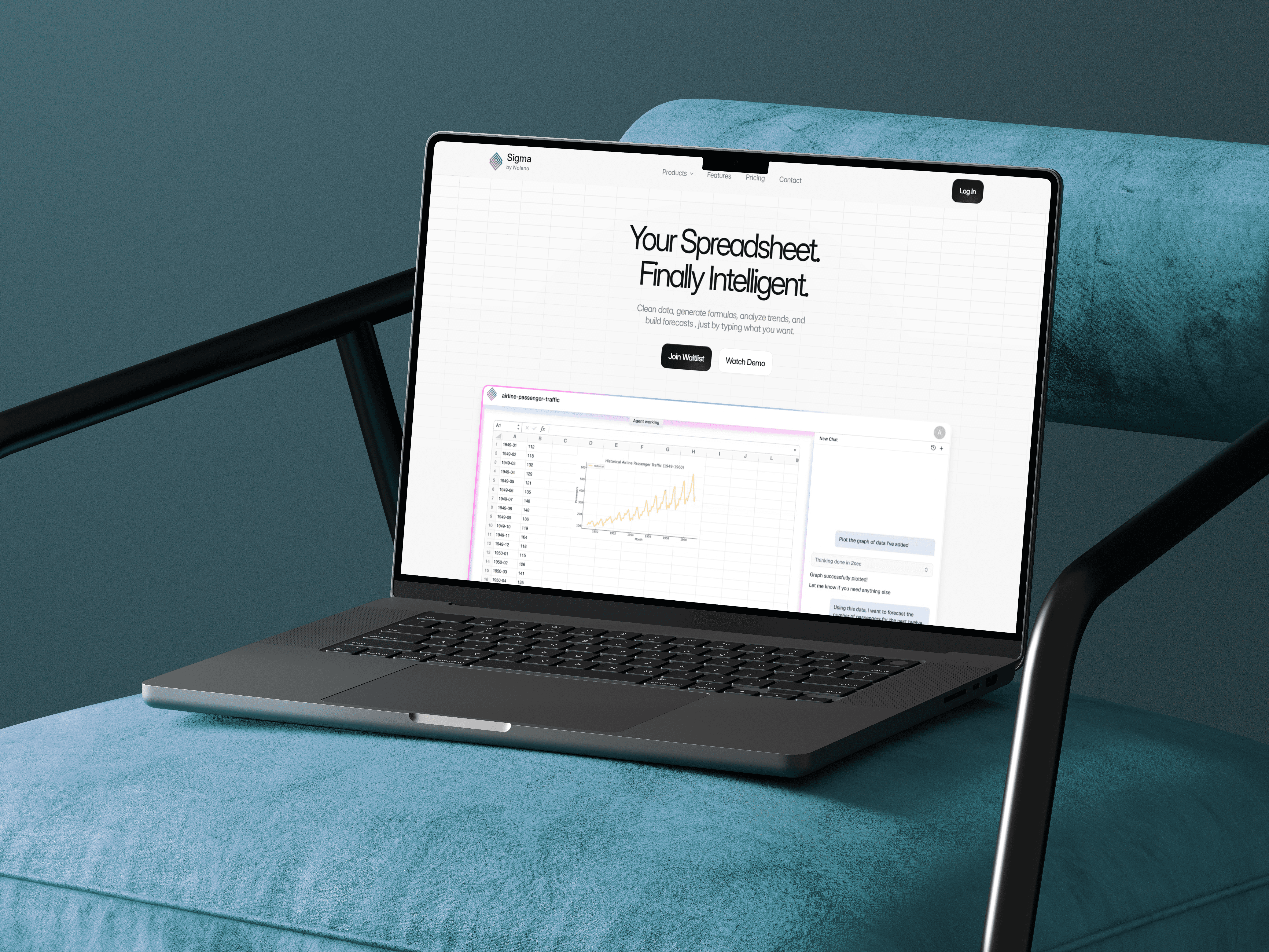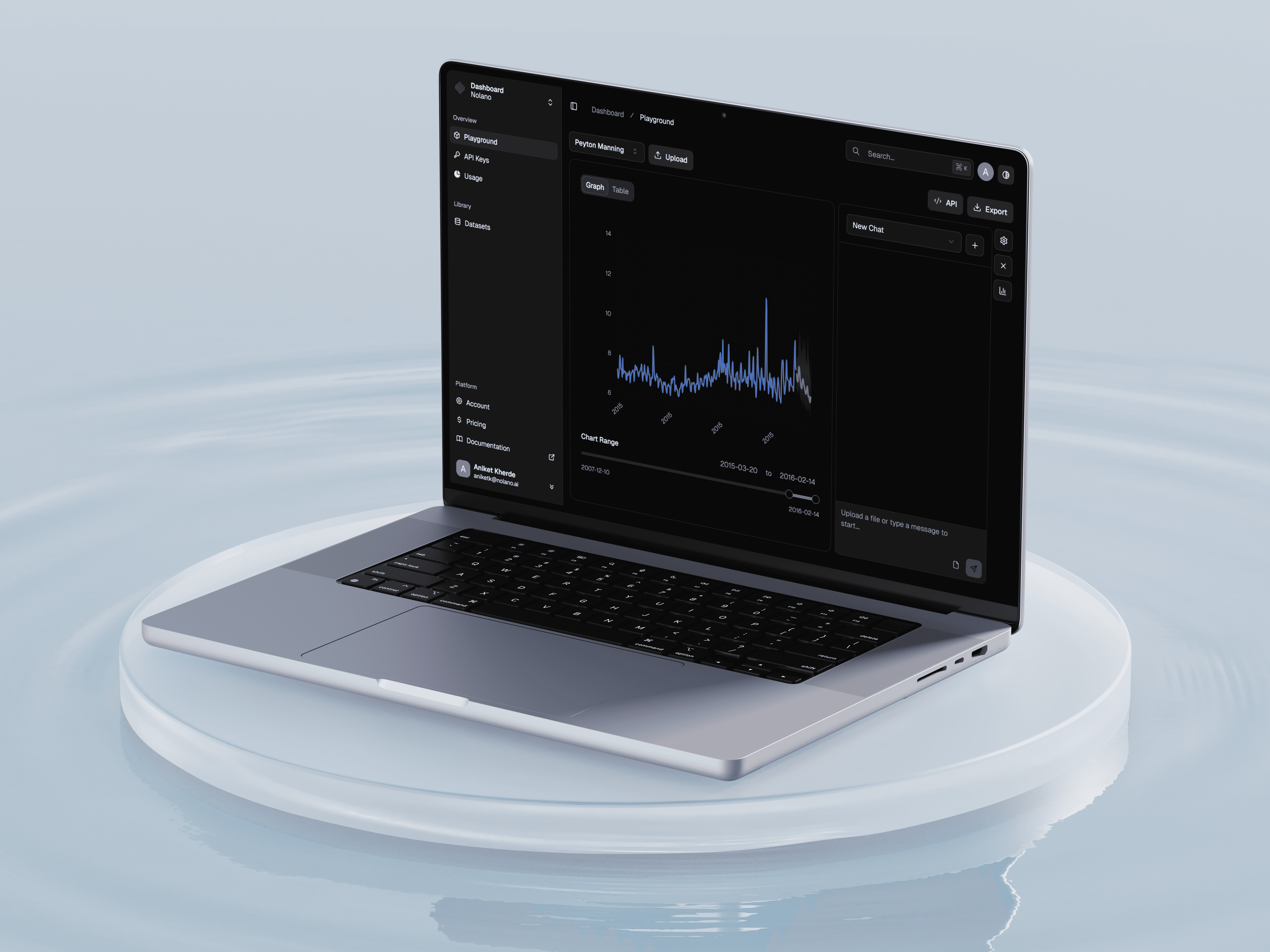
Problem
Forecasting tools exist, but they’re made for data scientists.
Business users struggle with:
unclear steps (“What do I do first?”)
settings that feel technical and risky
no clear explanation of what the forecast means
The product needed to enable non-technical users to upload data, generate forecasts, and trust the result, without reading documentation or knowing ML terminology.
Goals:
Reduce friction for first-time users
Make the forecasting process feel guided, not technical
Show results in a way that’s explorable and trustworthy
Constraints:
Dark theme required (existing design system)
Must work for both simple CSV uploads and large structured enterprise data
UI needs to scale to API + manual workflows
Primary workflows identified:
Upload dataset → run forecast → view output
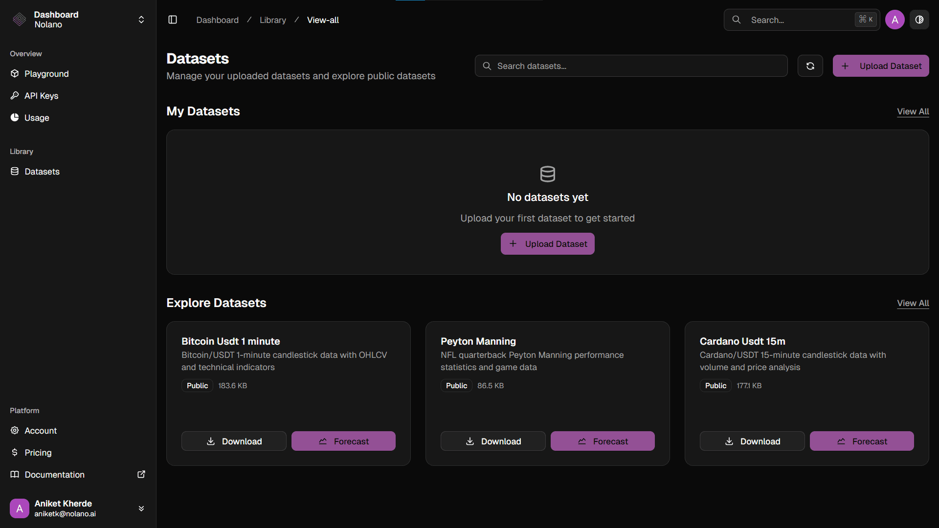
Try a sample dataset before committing to own data
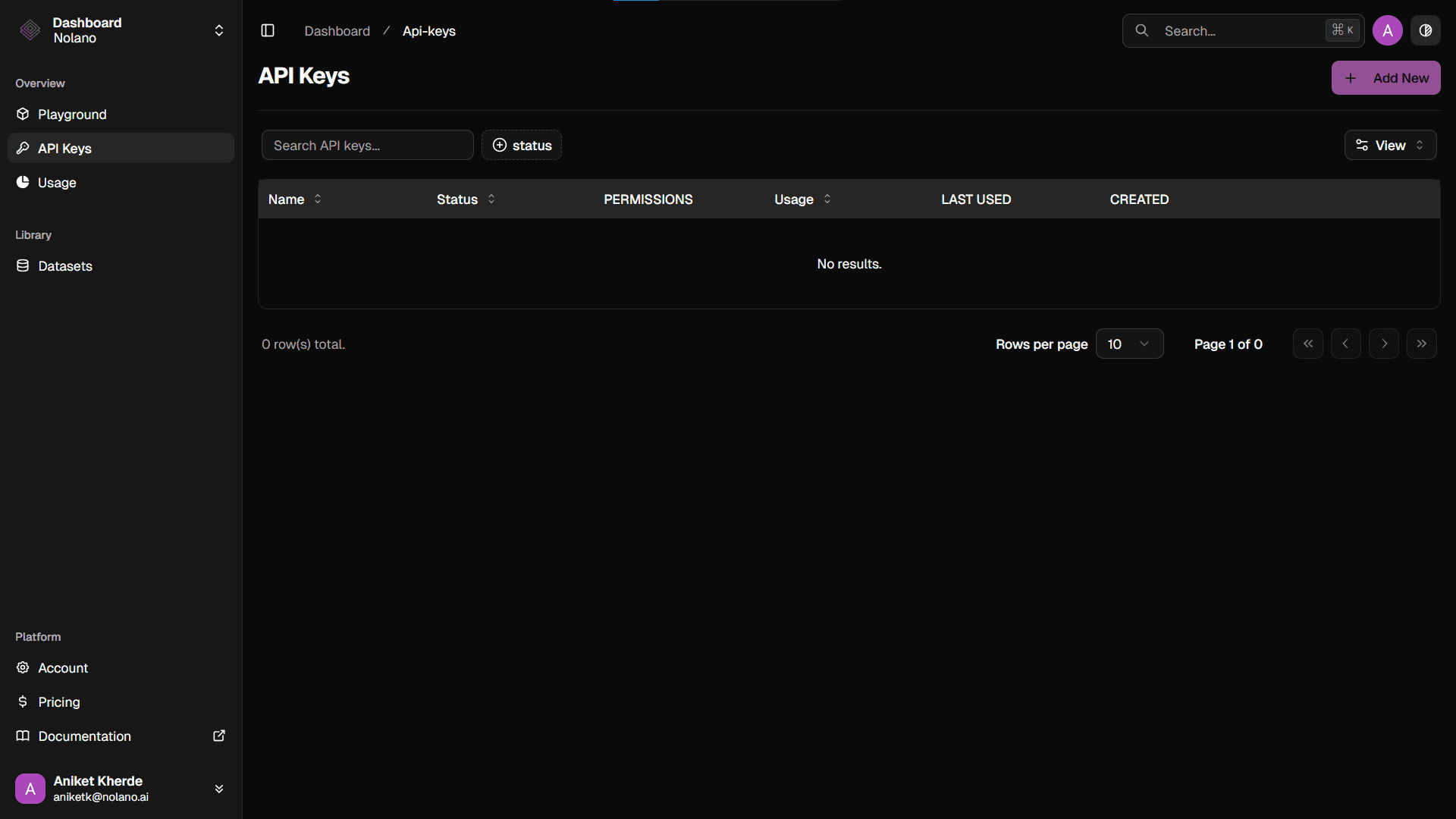
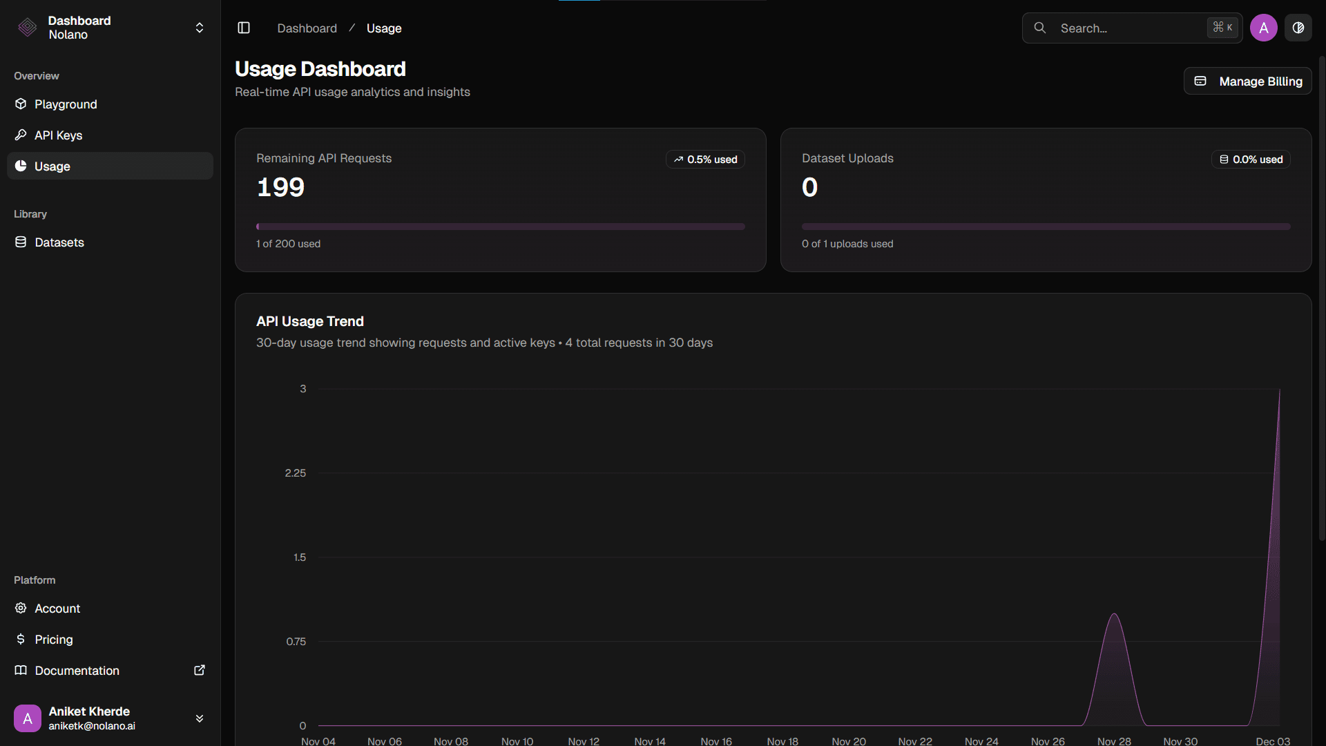
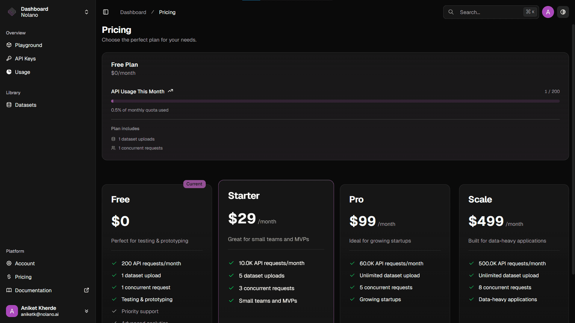
Review API usage, history, and billing as the product scales
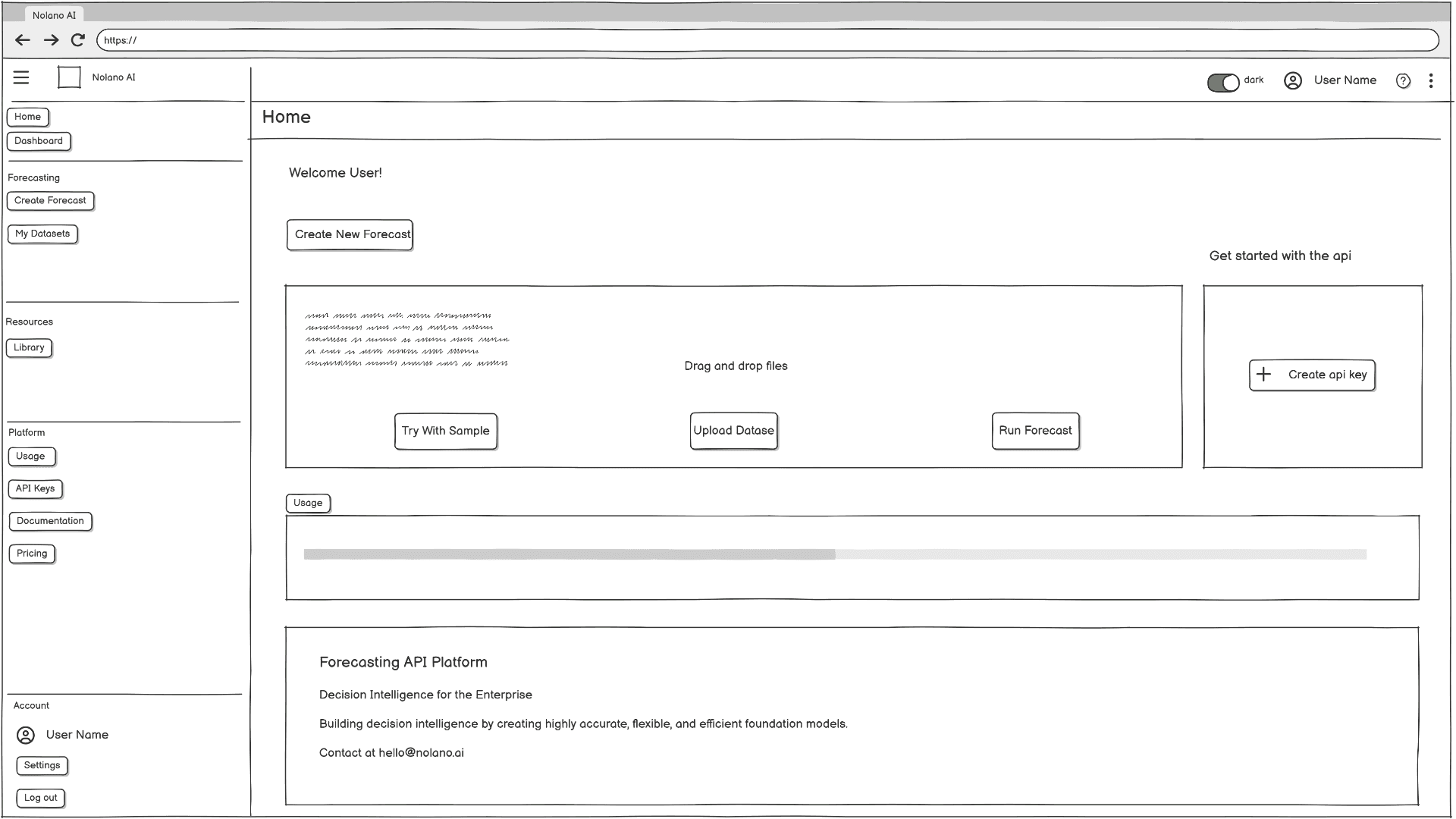
Early Exploration:
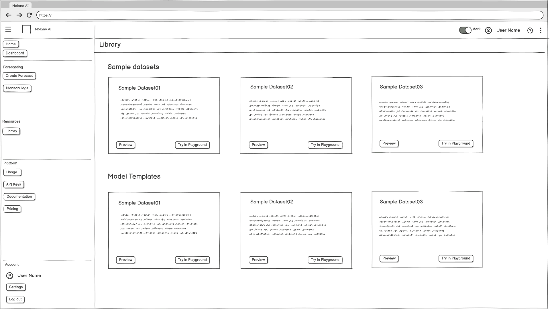
Exploration A: Dashboard-first layout
Pros: Everything visible
Cons: Overwhelming for new users
—
—
Key Design Decisions
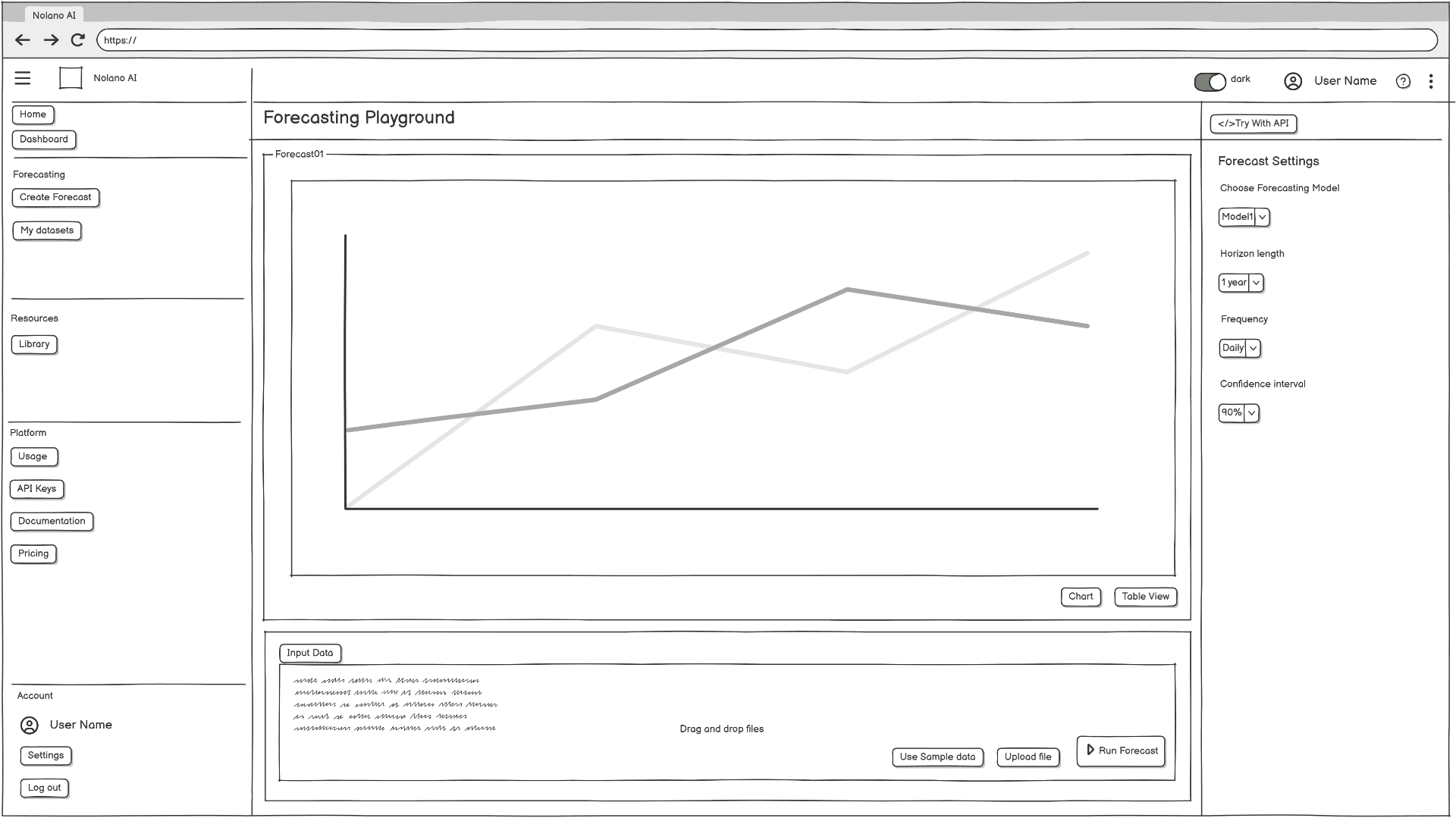
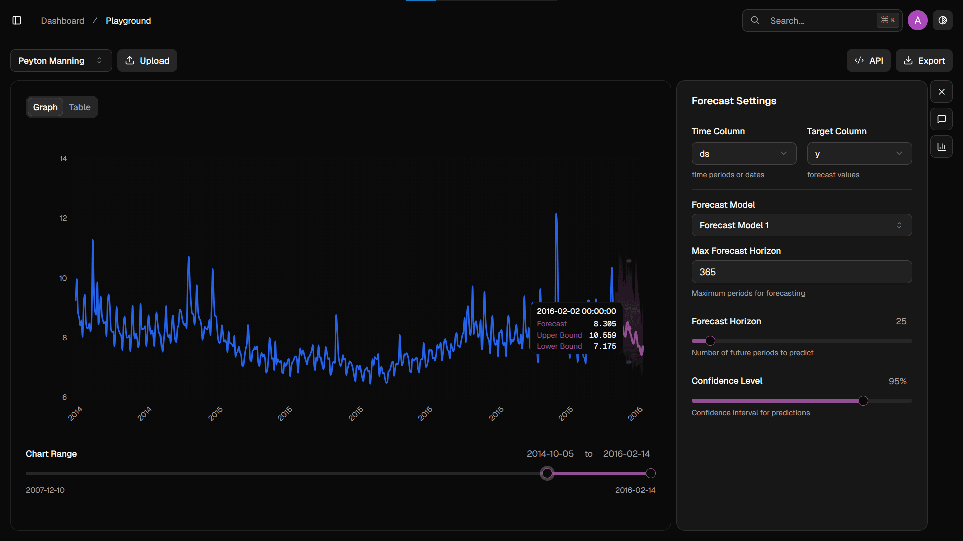
Decision 1: Split-pane layout
Reason: Users needed to view input + chart + configuration without switching screens.
Alternatives tested: modal workflows, wizard flows.
Outcome: Split pane allowed faster iteration and fewer “where am I?” moments.
Decision 2: “Use Sample Data” CTA
Insight: Users hesitate to upload their real dataset without seeing value.
Result: Added a frictionless “Try With Sample” workflow.
Impact: Reduced onboarding drop-off and made demos easier.
Decision 3: Invisible guidance through defaults
Setting defaults for model type, confidence interval, and horizon made the product usable without ML knowledge.
Users could edit settings later instead of being forced to decide upfront.
Results:
Team successfully used this interface for live demos and onboarding calls.
Stakeholders reported reduced explanation time during demos.
Developers used layout clarity to reduce ambiguity during implementation.