Sigma

Sigma

AI Native Spreadsheets

AI Native Spreadsheets

Client

Nolano

Client

Nolano

Client

Nolano

Stack

Framer, Figma, Premiere pro

Stack

Framer, Figma, Premiere pro

Stack

Framer, Figma, Premiere pro

Timeline

1 month

Timeline

1 month

Timeline

1 month

Year

2025

Year

2025

Year

2025

Cover Image
Cover Image
Cover Image

About the project

About the project

About the project

Problem

Spreadsheets are already a solved mental model. Everyone knows Excel and Google Sheets.
Our challenge wasn’t to explain a spreadsheet.
It was to explain why this one is fundamentally different, without overwhelming users with technical explanations or AI jargon.

The risk:

If the message wasn’t immediately clear, the product would be seen as “another SaaS automation gimmick”, not a category shift.

Core Positioning

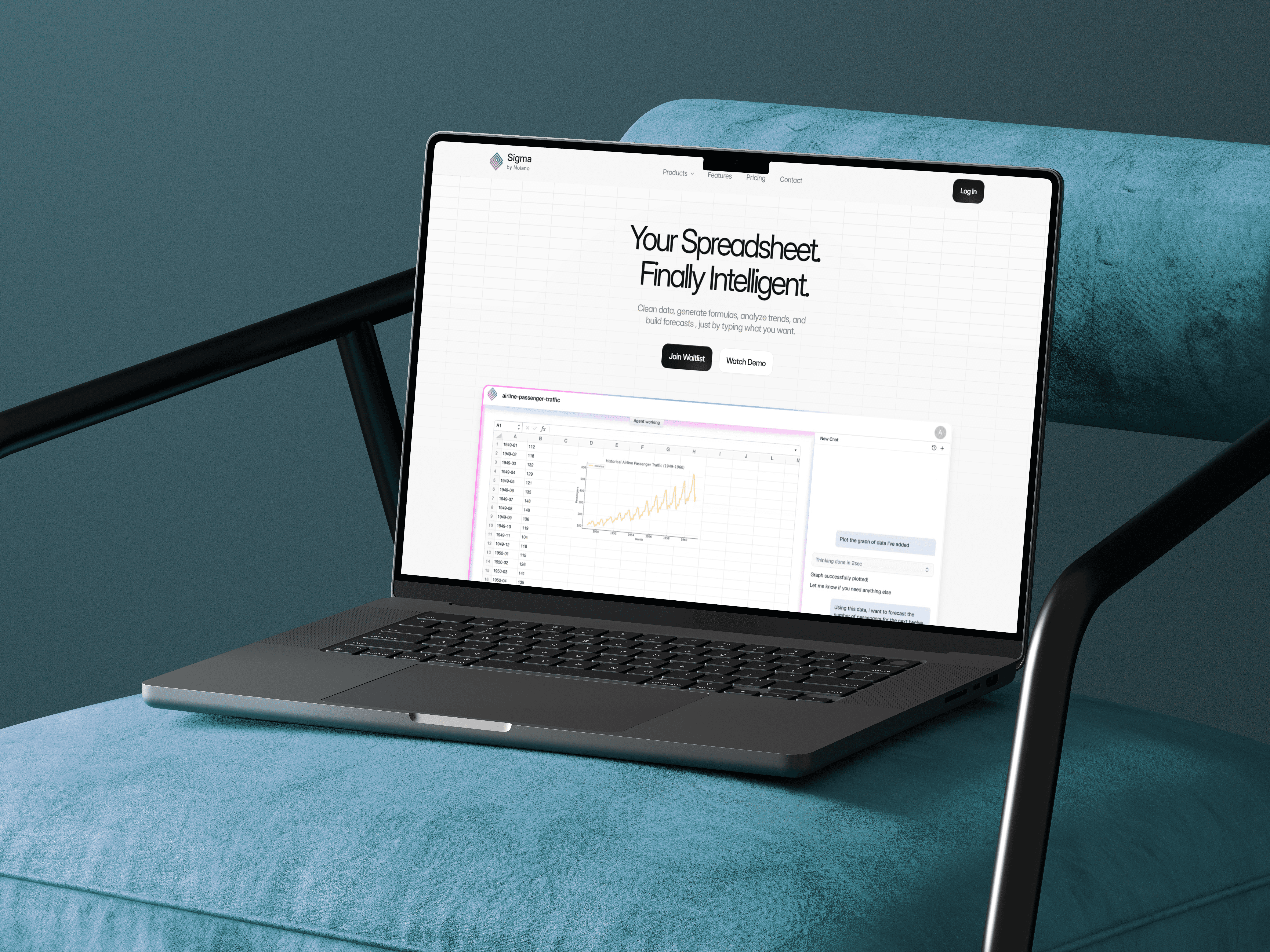
“Your Spreadsheet. Finally Intelligent.”

We explored multiple positioning angles:

  • speed

  • accuracy

  • AI capability

  • automation

  • “spreadsheet assistant”

The winning angle was clarity and disruption: this isn’t a plugin, a bot, or a feature, it’s a new category: an intelligent spreadsheet.

Key Design Decisions

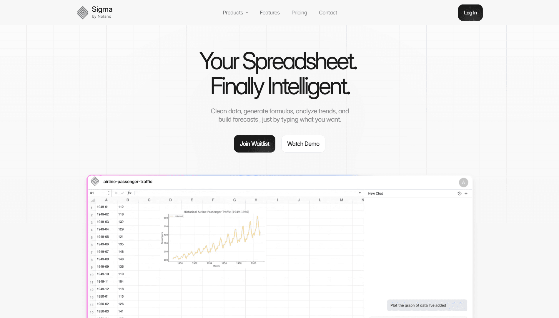
Decision 1 : Product UI first, Instead of stock imagery

  • We used real interface screenshots as the primary visual language.

  • This reduced abstraction and helped users immediately understand what Sigma actually is.

Decision 2 : Focus on Clear, Practical Messaging Instead of Technical Complexity

  • content structured to explain capabilities in plain English without overwhelming users with technical terms or AI language.

  • Feature descriptions with a real use case for immediate understanding of why it matters and how it applies to their workflow.

Decision 3 : The waitlist button is everywhere

  • Since the product is in pre-launch, the goal isn’t conversion to purchase

  • Waitlist CTA appears in predictable intervals throughout the page

  • So the CTA shifts from “sell” to “qualify interest”.
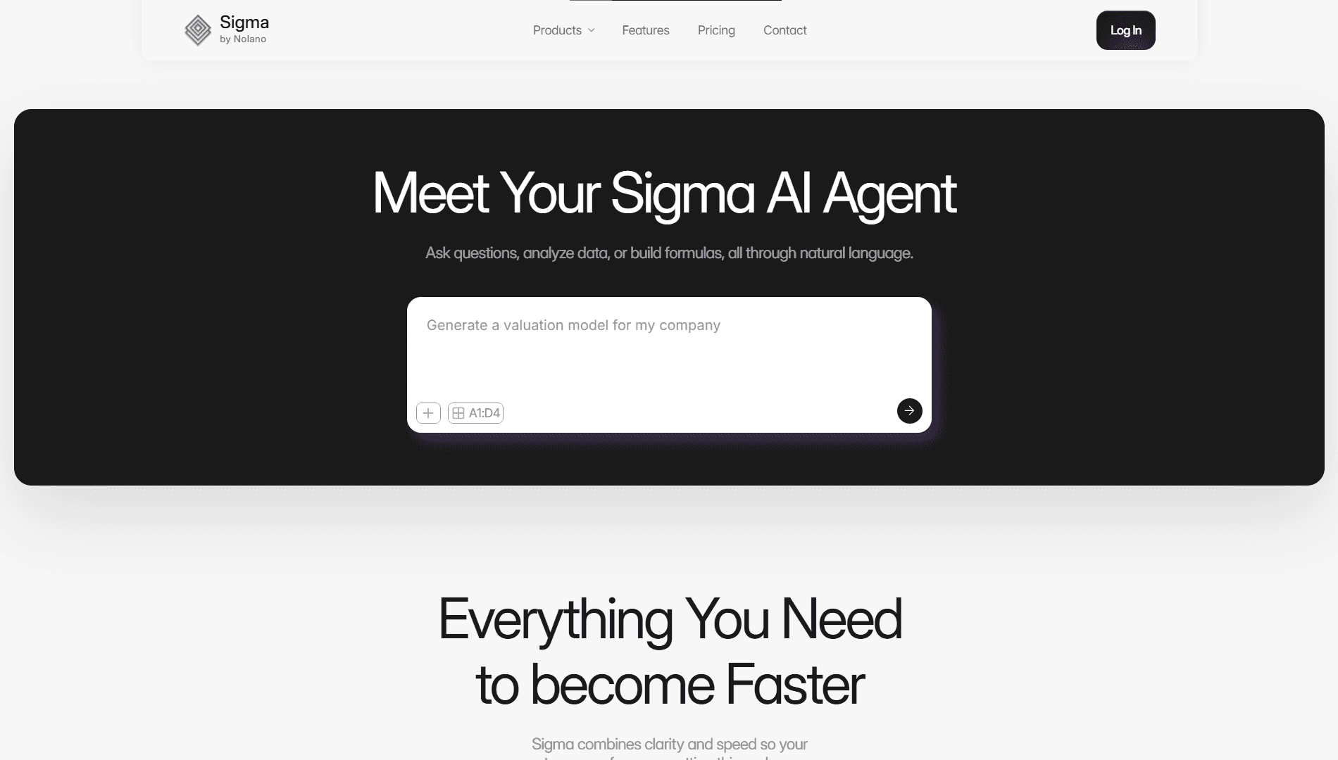
Goal: Establish a clear, confident value proposition in the first 3 seconds. Rationale: Previous versions opened with product features. Hiring managers and users skim. This headline format communicates the promise first, feature second. Outcome: Higher clarity → reduced bounce behavior during internal testing.

Intent: Communicate how Sigma transforms the spreadsheet experience, from formulas to conversational input. Design Detail: The minimalist textbox reinforces simplicity while anchoring attention on interaction, not interface.

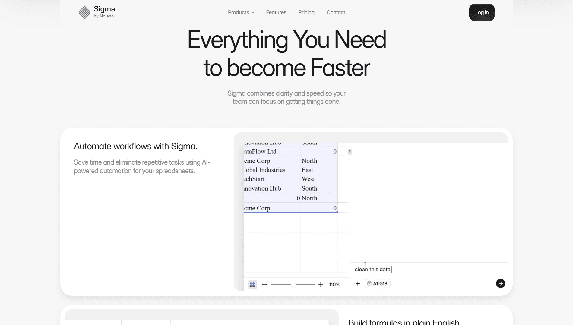
Strategy: Convert complex AI capabilities into digestible scroll-based modules. UX Insight: Users understand faster when they see feature → example → outcome in one sequence.

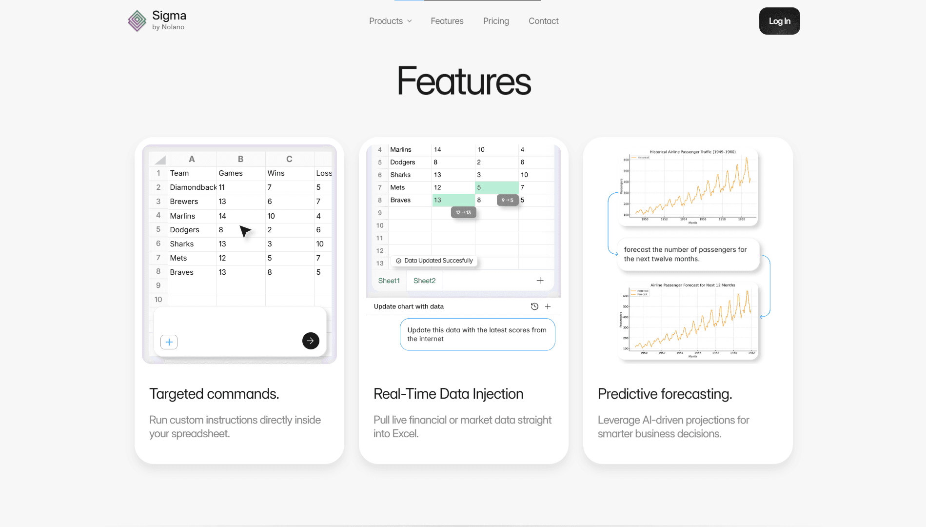
These feature cards were designed to break feature complexity into three scannable chunks. Each follows a pattern: headline → visual → micro-description → real-world usage example.

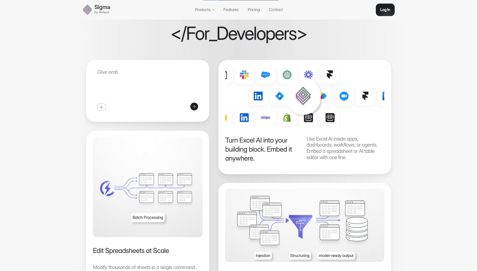
Audience split: Analysts and developers require different messaging. This section reframes the product as a platform, not just a tool.

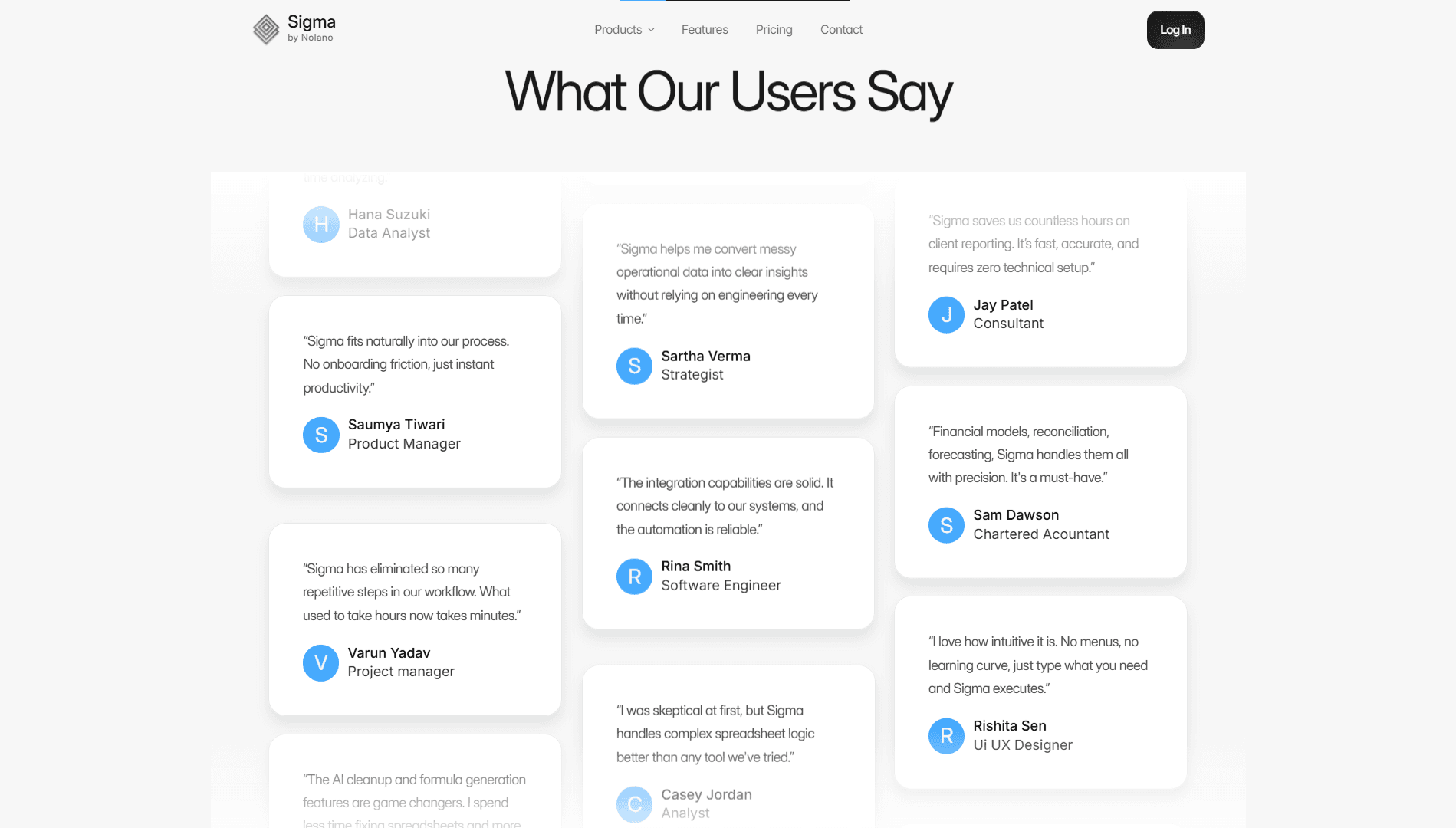
Role of this section: Reduce adoption anxiety by letting users validate the value through role-relevant testimonials.

Visuals

Visuals

Visuals

Impact:

  • This wasn’t just visual design, it was positioning.

  • Clear message adoption: users described the product back using the same language

  • Delivered ready-to-launch asset ahead of engineering completion
Create a free website with Framer, the website builder loved by startups, designers and agencies.